

This article is part of our "How To: Growth" eBook, a comprehensive growth toolkit for founders and builders, which you can download here.
Introduction
A/B testing (sometimes called split or multi-variant testing) is foundational to growth marketing. It is an essential technique for any product or marketing team seeking to make data driven decisions (= all of them).
The basic concept is simple enough; two or more variations of “an element” are compared against each other to determine which performs better at achieving a specific goal.
The element can be basically any part of your acquisition funnel/ product, but the most common applications are in PPC, landing pages, and onboarding journeys. The goals are typically conversion-oriented. Two versions of a paid social media ad may be compared in terms of engagement or click-throughs. Landing pages may be evaluated in terms of form completion, or offer redemption. Onboarding journeys will typically focus on minimising churn through the funnel (i.e. conversion to next step). And so on.
In this guide, we (the testing veterans of Move78) will lay out our approach to A/B testing, exploring methodology, its many applications, some of the tools at your disposal, and a few common pitfalls. We’ll also provide a step-by-step guide to setting up your own tests, so let’s dive in.
Why test?
A/B tests are the most reliable route to improving performance, however, although the pursuit of efficiency is paramount, it is not their sole aim. The parallel objective is to build a deeper and richer understanding of your users, and ultimately make more informed decisions.
If you discover prospective customers respond well to certain messaging on social media, you may want to start testing a similar approach on your website. If a certain call to action (CTA) works well on a landing page, that may reflect something important about your user’s motivations that can be more widely applied.
Testing is a mindset. Certainty can be beguiling, but the truth is that no matter how smart you are, or how thorough your research has been, you won’t know everything on day one, and a huge proportion of the bad decisions we’ve witnessed over the years can be put down to overconfidence in early assumptions, or a failure to react to updated information.
“If knowledge is power, knowing what we don't know is wisdom.”
- Adam Grant
Testing programmes encourage us all to behave more like scientists, treating these assumptions as hypotheses that require validation.
Best Practice: How to conduct A/B tests
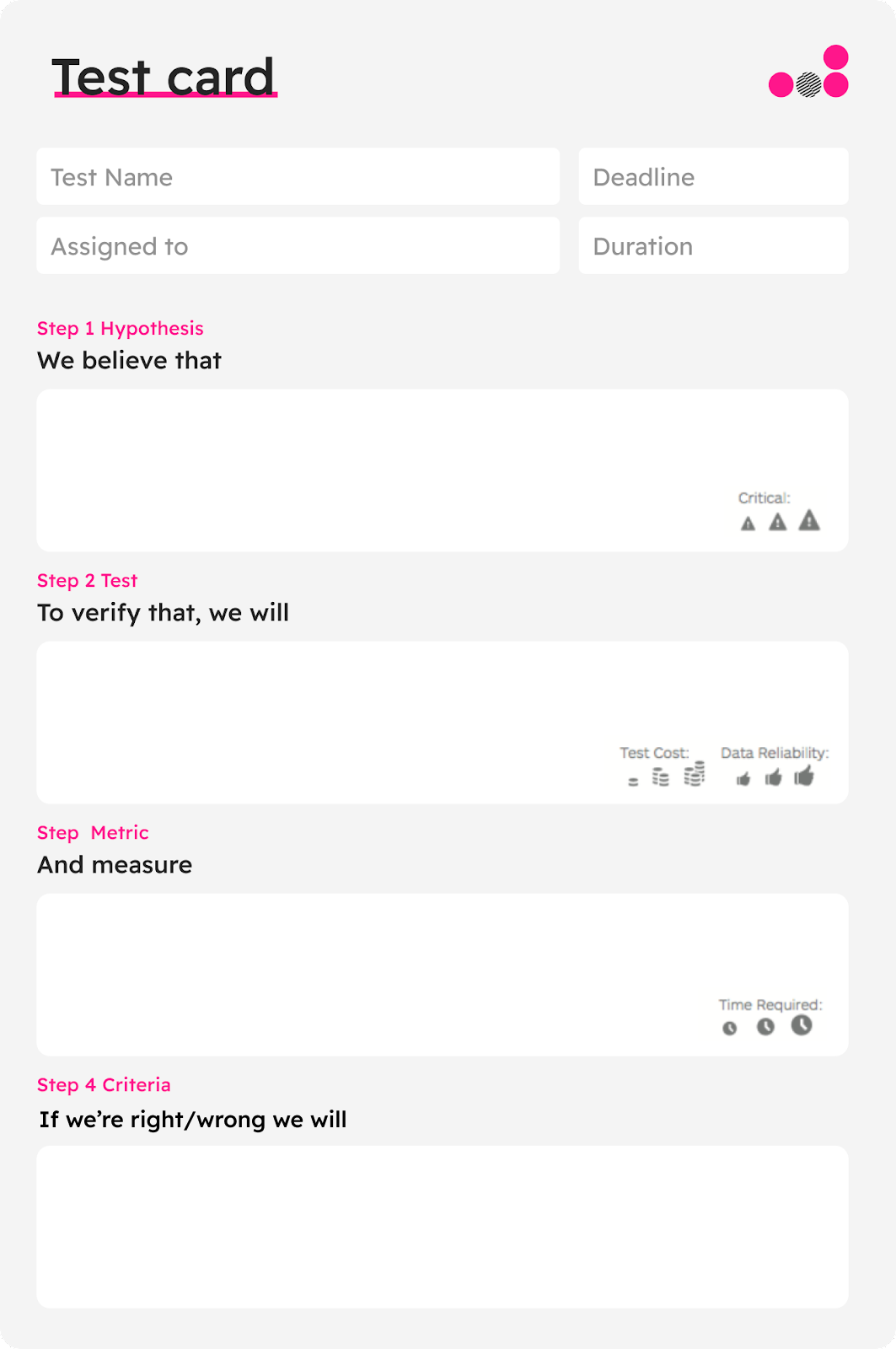
Step 1: Define your goal and hypothesis
Before starting your A/B test, it's essential to define a clear goal and hypothesis. A well-structured hypothesis includes the following components:
- Hypothesis: A statement about what you believe will happen as a result of the test (e.g., "Changing the CTA button colour will increase conversions").
- Testing method: The approach you will use to test the hypothesis (e.g., change the colour and measure results).
- Metric to measure: The key performance indicator (KPI) you will track to determine the test's success (e.g., conversion rate).
- What you will do if you’re right/ wrong: Your action plan if the hypothesis is correct (i.e. implement the winning variation across all landing pages), or incorrect (i.e. test a different element or try a new variation).
Step 2: Create your test variations
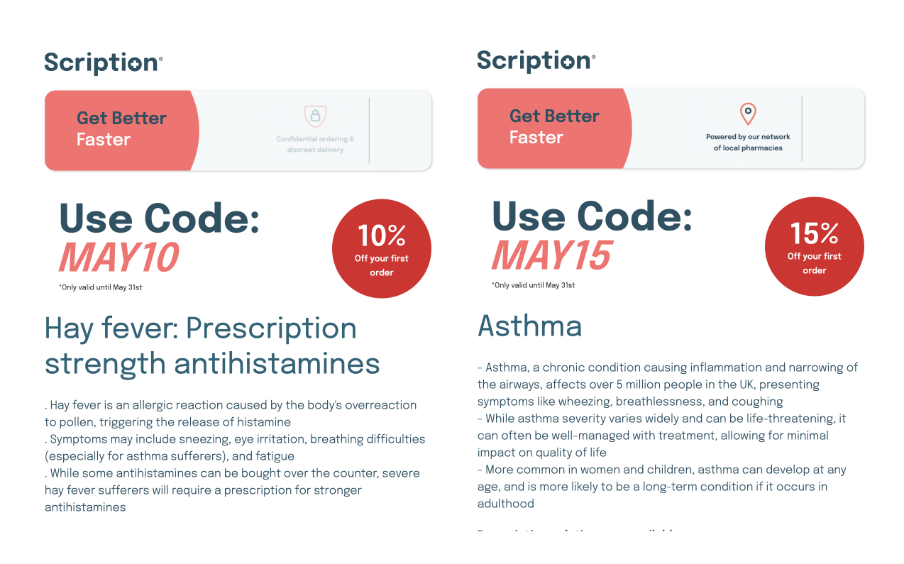
Design and implement the different variations of the element(s) you want to test. Be sure to only change one variable at a time to accurately measure the impact of the change.
Alternatively, you can change two completely different versions of your page or ad; just keep in mind that this kind of test will not really allow you to learn which change has brought about the improvement (was it the new copy, the change in colour, or the different messaging?).
That being said, this is still a useful test, particularly in cases where you’re rolling out a new website or branding and want to test if the aggregate changes you’ve made have actually been for the better or not. If they haven’t then why not become an interesting question, and a basis for further tests.
Step 3: Determine your sample size and duration
Decide on the sample size for your test and how long it will run. The sample size should be large enough to achieve statistically significant results, and the duration should be long enough to account for any fluctuations or anomalies. So depending on your traffic, you may need to run the test for anything between 1 and 3-4 weeks.
You also want to establish the required confidence level…
Step 4: Launch the test
Once your variations are ready, and you've determined your sample size and duration, launch your A/B test using your chosen tool or platform (more on this below).
Step 5: Monitor, analyse, take action
Keep an eye on your test's performance throughout its duration. Analyse the data to identify trends and compare the performance of the variations.
After the test is complete and you've gathered sufficient data, evaluate the results to determine which variation performed better. If one variation significantly outperformed the other, consider implementing that change across the board. If the results were inconclusive or showed no significant difference, reevaluate your hypothesis and consider running a new test with different variables.
A/B Testing Pitfalls
Statistical significance
Statistical significance plays a pivotal role in establishing the dependability of your A/B test outcomes. It aids in confirming that the disparities in performance between the variations aren't merely coincidental. Although the majority of A/B testing tools offer statistical significance calculations, it's vital to grasp the concept and apply it accurately when assessing your test results.
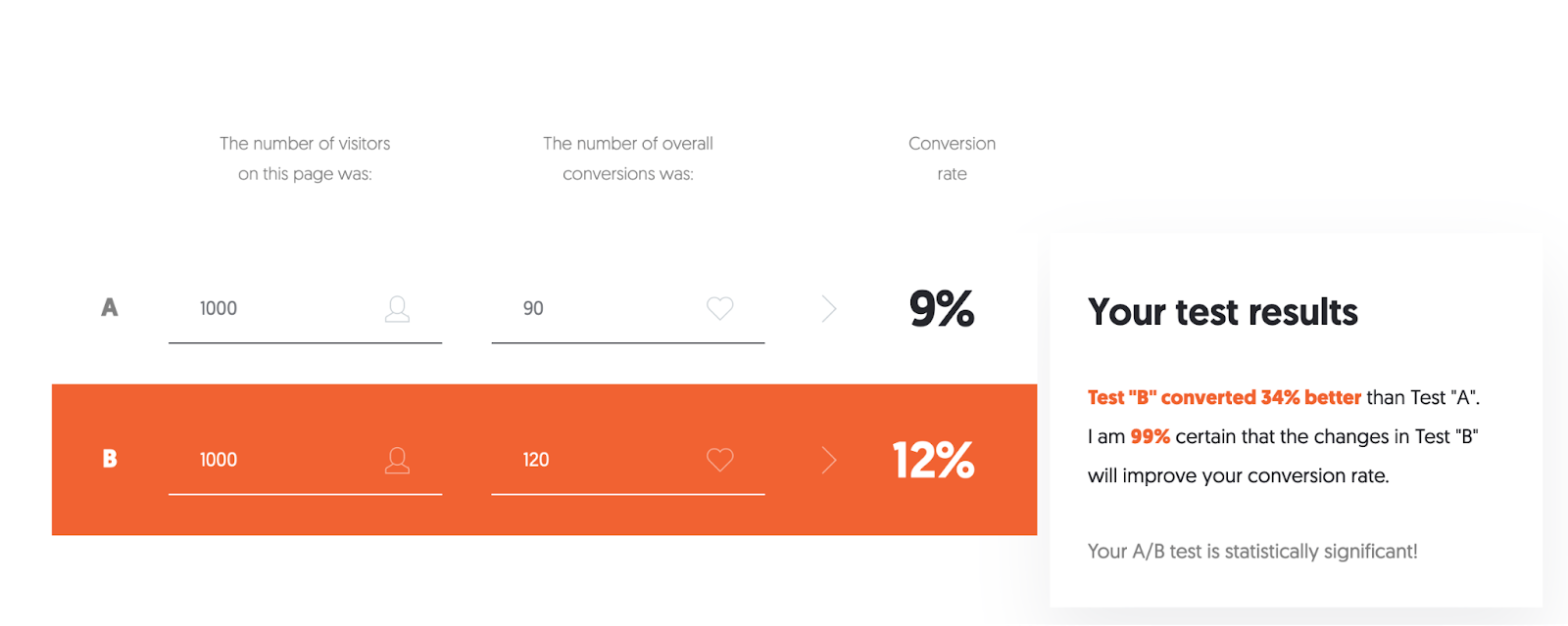
In general, a statistically significant result has a significance level of at least 95%, meaning there is less than a 5% chance that the observed difference occurred randomly. When analysing your A/B test results, be sure to take into account statistical significance, sample size, and the duration of the test to make informed decisions and avoid drawing incorrect conclusions.
Not fixing variables
It is crucial to keep all variables constant except for the one being tested. If multiple elements are changed simultaneously, it becomes challenging to identify the specific change that caused any variation in performance. For instance, if you alter both the headline and the image on a landing page, and see a difference in conversion rates, you won't be able to pinpoint whether it was the new headline, the new image, or a combination of both that led to the result. Therefore, it's recommended to test one variable at a time to gain clear and actionable insights from your A/B tests.
Not specifying subsequent action
A well-structured A/B test should not only define a hypothesis and the metric to measure but also specify the subsequent action based on the test outcome. Whether the hypothesis is proved right or wrong, you should know in advance what your next steps are. If the hypothesis is correct, you might decide to implement the winning variant across the board. If it's incorrect, your action plan might involve testing a different element or trying a new variation. Planning for these outcomes ahead of time ensures that you can act quickly and decisively once the results are in.
Not testing big things first
You should always aim to prioritise testing high-impact elements first. While it might be tempting to tweak smaller details such as button colours or font types, these changes often don't have a significant impact on overall performance. Instead, focus your efforts on testing more substantial changes first – for example, different page layouts, unique value propositions, or entirely different approaches to your call-to-action. Starting with "big" tests can lead to more significant improvements in your conversion rates and provide a better return on your testing efforts than testing what difference changing the colour of the landing page footer makes.
What to test?
As outlined above, A/B testing can be applied to basically any part of a user journey, however the most common candidates for testing are:
- Ads - Creative, Messaging, CTA, Targeting
- Landing pages - Headline, Creative, Lead Forms, On-page elements (ie. Social Proof)
- Onboarding and users flows - Input elements (address finders, SSO), Splitting screens, Integrating chat bots, Adding progress bars etc.
Ads
Testing ad variations is the foundation of campaign optimisation. By default, Meta and Google will allocate budget towards better performing variations (although you can turn this off). This is a useful feature for getting fast results, although not all that rigorous. (They’re actually using a method called the multi-armed-bandit technique, which you can read more about here). LINK
Testing mechanics have changed a lot with the introduction of dynamic ads and Performance Max campaigns.
With static ads (2 fixed headlines) you would just set up 2 or more variations of headlines and/ or descriptions, and compare the CTR across various keywords.
With dynamic search ads, advertisers upload up to 15 headlines and 4 descriptions, which Google then combines randomly to find effective combinations. This makes comparison a little tricky.
There is a way to assess comparative performance, although you need a lot of campaign data. On the ad level view, click “view asset details” below the ad. You should see a Performance column on the asset, which rates assets from Poor to Best.
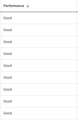
Given enough time, these results will paint a picture of what’s working well. For example, you may see price-led headlines outperforming the brand-led messages (ie. From £15.99/ 50% off first order). Make sure you include a variety of different angles in your headlines and descriptions so that patterns begin to emerge. If the variations are too similar, you won’t learn much.
This is a looser kind of A/B testing than most marketers will be comfortable with, but it does get results quickly. If you want to get more specific, head to the Experiments section.
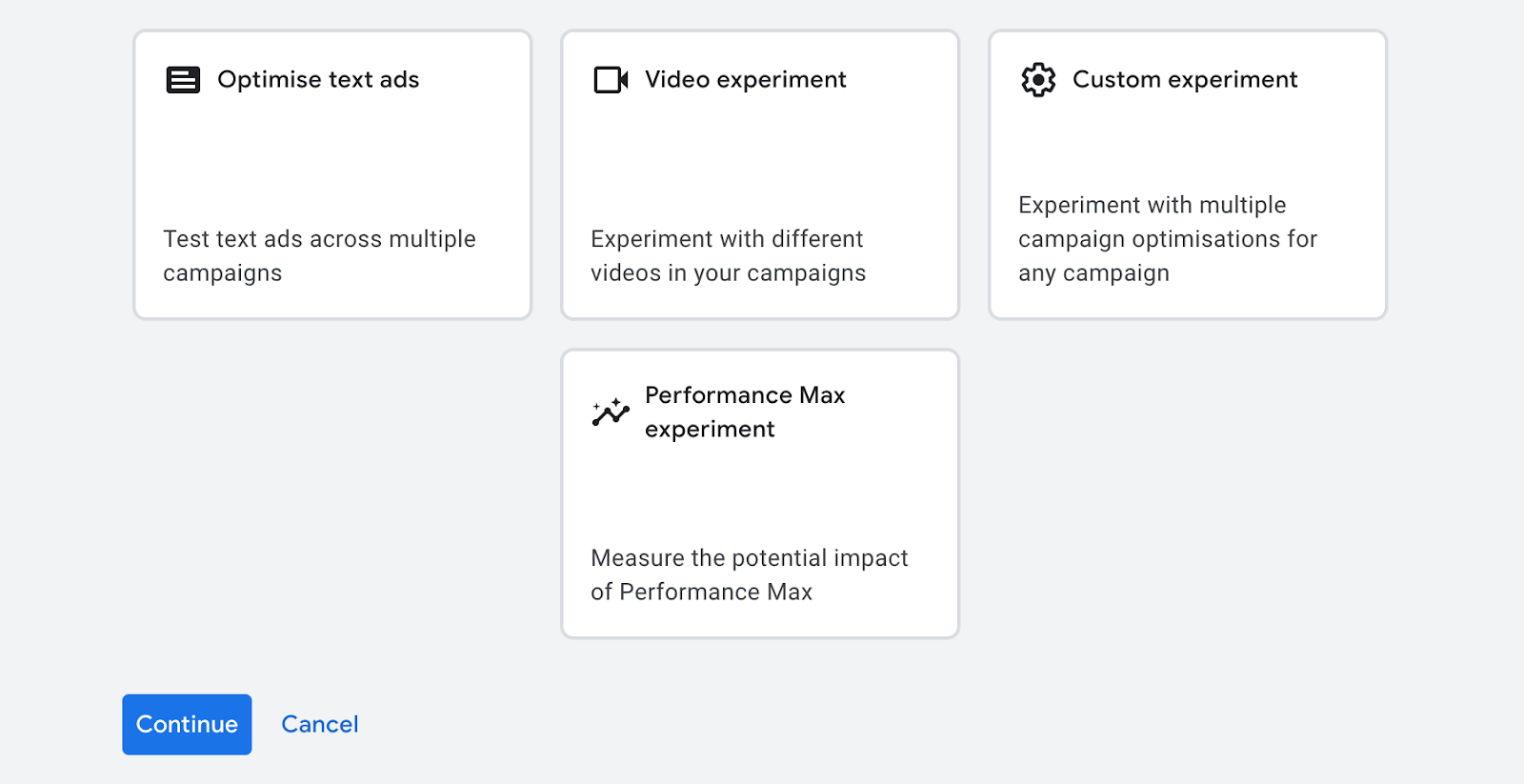
Here you can set up more rigorous tests around specific elements:
- Find and replace ad text to create new variations, or insert new headlines
- Test the uplift generated by Performance Max campaigns (sadly you can’t test specific elements within them)
- Compare video performance in display campaigns
- Compare bid strategies and keyword groups
Meta
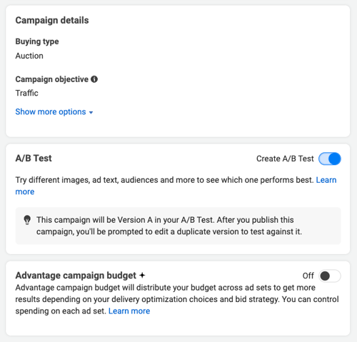
Meta also has a specific A/B testing tool which you can use to run A/B tests in a more structured way. What we outline in this guide allows you to test a few different ads and analyse the performance to derive your own conclusions. The A/B testing tool allows you to change something in an ad and see if that change improves performance or not. This can be the creative, audience or placement, or something else. If you have a specific hypothesis you’d like to test, try out the Meta A/B testing tool.
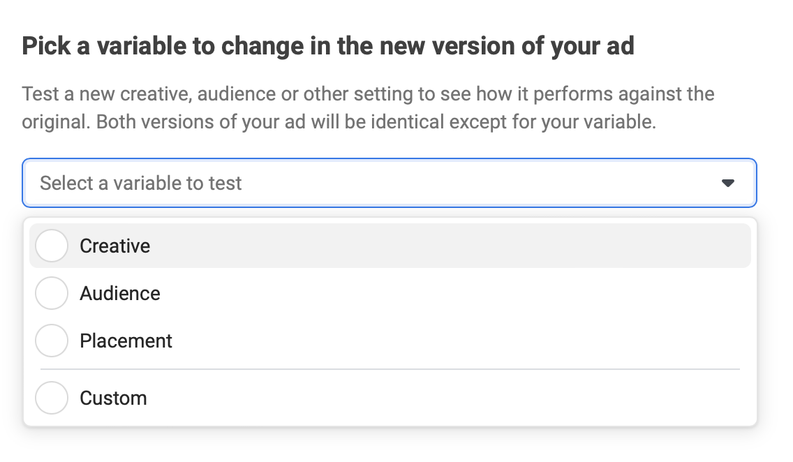
But try not to test too many variations at once. Unless if you’re working with huge budgets, 3 variations is probably the most you should have per each ad group.
The choice of elements to test can be quite diverse. In addition to the above, consider testing different audience segments and targeting parameters. For instance, you could compare the performance of the same ad shown to two different demographic groups or geographic locations. This can provide insights into which audience segment responds best to your message.
Another approach can be testing different formats of your ads. For example, a carousel ad might perform better than a single image ad for certain products or services due to its ability to showcase multiple features or angles. Likewise, testing video ads against static image ads can help determine which format resonates more with your audience. This kind of testing could uncover new opportunities and areas for expansion within your marketing strategy.
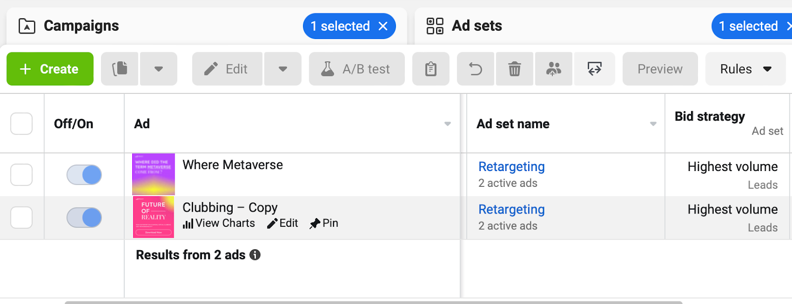
A word of caution: when running multiple A/B tests simultaneously, it's essential to keep a meticulous record of your changes and results (see below on structured hypothesis and experimentation). This is because the results of one test could potentially influence the outcomes of another, leading to skewed or inaccurate conclusions. Having a structured process in place to document and analyse your tests will save you from potential confusion and data loss later on.
Landing Pages
Landing pages have a big impact on conversion, and are typically easier to test than other parts of onboarding. The classic test candidate is the blue vs red CTA button, although varying your headlines, header images and form fields will typically make more of an impact.
Promotions and discounts should always be rolled out as A/B tests (ie. 10% vs 20% off), to measure the uplift on conversions. Testing alternative funnels can also be very instructive, helping you answer questions around what level of sales intervention is optimal (e.g. Book a Demo instead of Buy Now). If Book a Demo is converting at a higher level, and the demos also convert prospects to customers at a high rate, it’s probably a worthwhile investment for your sales team.
You may also want to zoom out and test a long-form version of your landing page against a shorter, more concise version. It’s often hard to know whether removing the more detailed explanation will streamline the process, or leave visitors feeling confused. By changing the sequence of information or the placement of certain elements, you can assess how these changes impact user behaviour and conversion rates. For instance, does having testimonials closer to the top of the page build more trust and increase conversions? Or perhaps, moving a persuasive video from the bottom to the middle of the page keeps visitors engaged for longer?
It is more than likely the majority of your visitors will be browsing on mobile devices, so it's crucial to optimise their experience. You could, for instance, test the effectiveness of "sticky" CTAs that remain visible as users scroll on their mobile devices. Similarly, you might experiment with different mobile navigation menus to see which is most user-friendly and effective at driving conversions.
This is really just the basics of what’s possible for landing pages. Check out our article on How to Design High Conversion Landing Pages for more inspiration on what to test.
User Journey
Optimising a user journey typically involves qualitative user testing to guide redesigns, followed by quantitative validation via A/B tests. Essentially, you want to be sure that your redesigns really do deliver a better experience before rolling them out fully.
Experience design best practice is beyond the scope of this guide, but at a high level, some things you may want to consider are switching around the order of steps, removing unnecessary form elements, integrating autofill tools like SSO, and adding expectation management UI like progress bars, and/ or % completion indicators.
You’ll probably need to speak to your development team about rolling the two journey’s out simultaneously, and splitting traffic between them. If this isn’t possible a T-test is a viable alternative, where you compare different cohorts of users over time (i.e. before and after X change).
If you’re interested in knowing more about how you could improve your journeys, get in touch with our team for a free growth audit. LINK
Tools for A/B testing
Some popular options A/B testing tools include:
Google Optimize
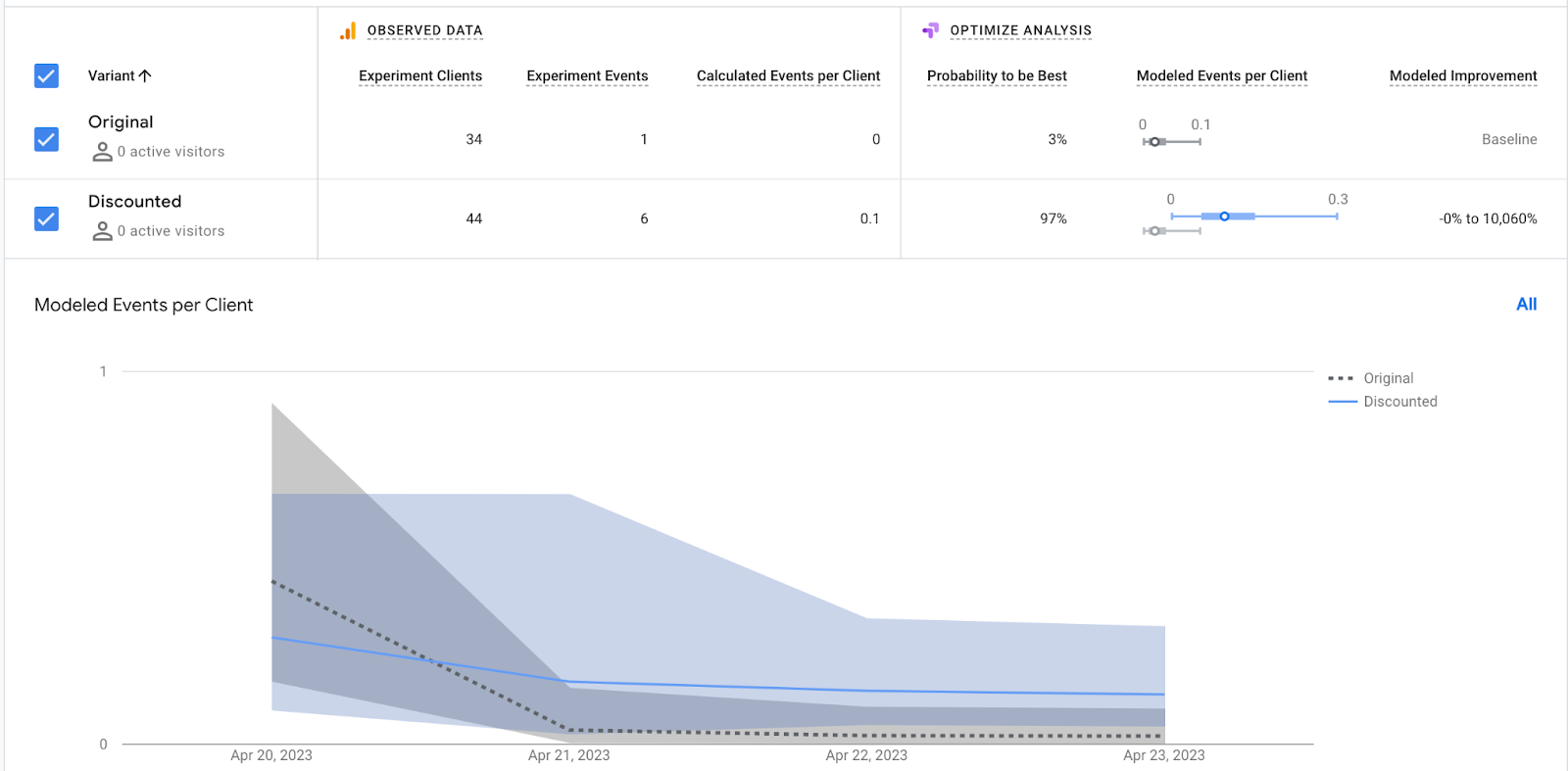
A free tool from Google that integrates with Google Analytics, allowing you to test variations of your website. Unfortunately, this great and handy tool is being discontinued in summer of 2023, and so you may need to look at one of the paid alternatives available today.
Optimizely
A popular paid A/B testing platform with a wide range of features and an easy-to-use interface. Pricing for Optimizely varies based on the size and needs of your business, starting with a basic plan at $50 per month, going up to custom pricing for enterprise-level solutions.
VWO (Visual Website Optimizer)
Another paid A/B testing tool with a robust set of features and strong analytics capabilities. VWO offers several pricing plans, with their entry-level "Growth" plan starting at $199 per month and higher-tier plans available for larger businesses with more advanced needs.
A/B Tasty
A comprehensive A/B testing platform that offers a user-friendly interface and powerful analytics, making it a solid choice for businesses looking to optimise their websites. A/B Tasty includes features like personalisation, heatmaps, session recordings, and audience targeting. Pricing for A/B Tasty starts with a basic plan at $79 per month, with more advanced plans available for businesses with greater demands and larger budgets.
In addition to these standalone A/B testing tools, advertising platforms such as Meta Ads (formerly Facebook Ads) also offer built-in A/B testing capabilities, allowing you to test different ad variations within their platform.
Conclusion

A/B testing is an indispensable method for refining your marketing campaigns, landing pages, and user journeys. By adhering to a systematic process, utilising the appropriate tools, and considering statistical significance, you can make data-informed decisions that enhance your conversion rates and overall user experience. So, dive in, begin testing, and witness your results soar!
If you're keen on discovering more about boosting your conversion rates through structured learning loops and growth experiments, don't hesitate to contact our team for a complimentary growth audit. We'll be happy to provide free advice and insights on how to elevate your campaigns, landing pages, and journeys.
Monthly Bulletin
Sign up for product, growth and GTM development tips for innovators


.png)


.png)


